Case Study
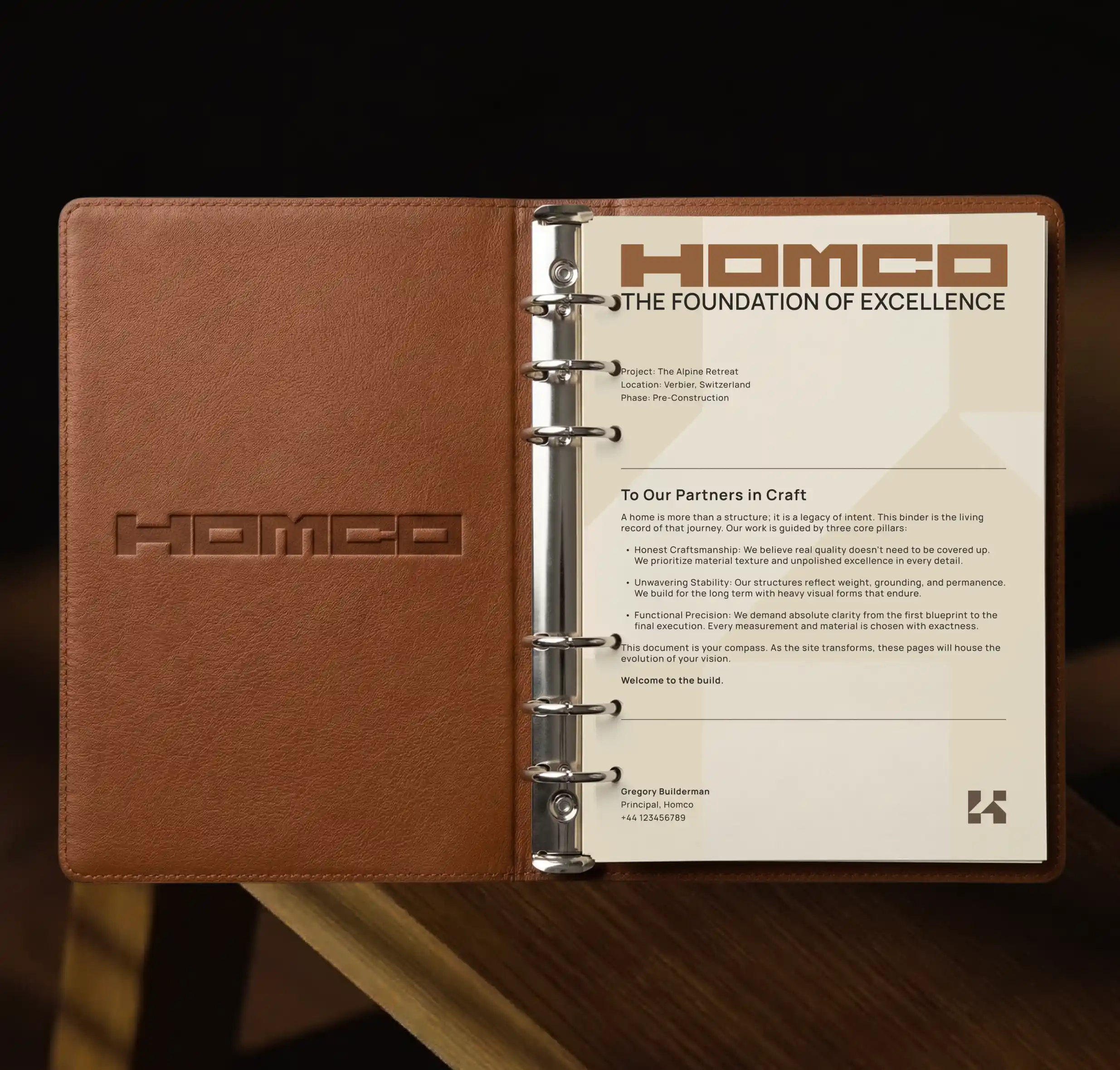
HOMCO operates within the premium construction sector, focusing on apartments, houses, and other habitats. The goal was to establish a visual presence that aligns perfectly with their core focus on structural integrity and precision engineering. The primary challenge was to craft a brand image that accurately reflects their technical mastery while making a promise of durability and refinement. The branding needed to seamlessly communicate their dedication to quality from the foundation to the final finishes, ensuring the company stood out in a competitive market.
The Solution:
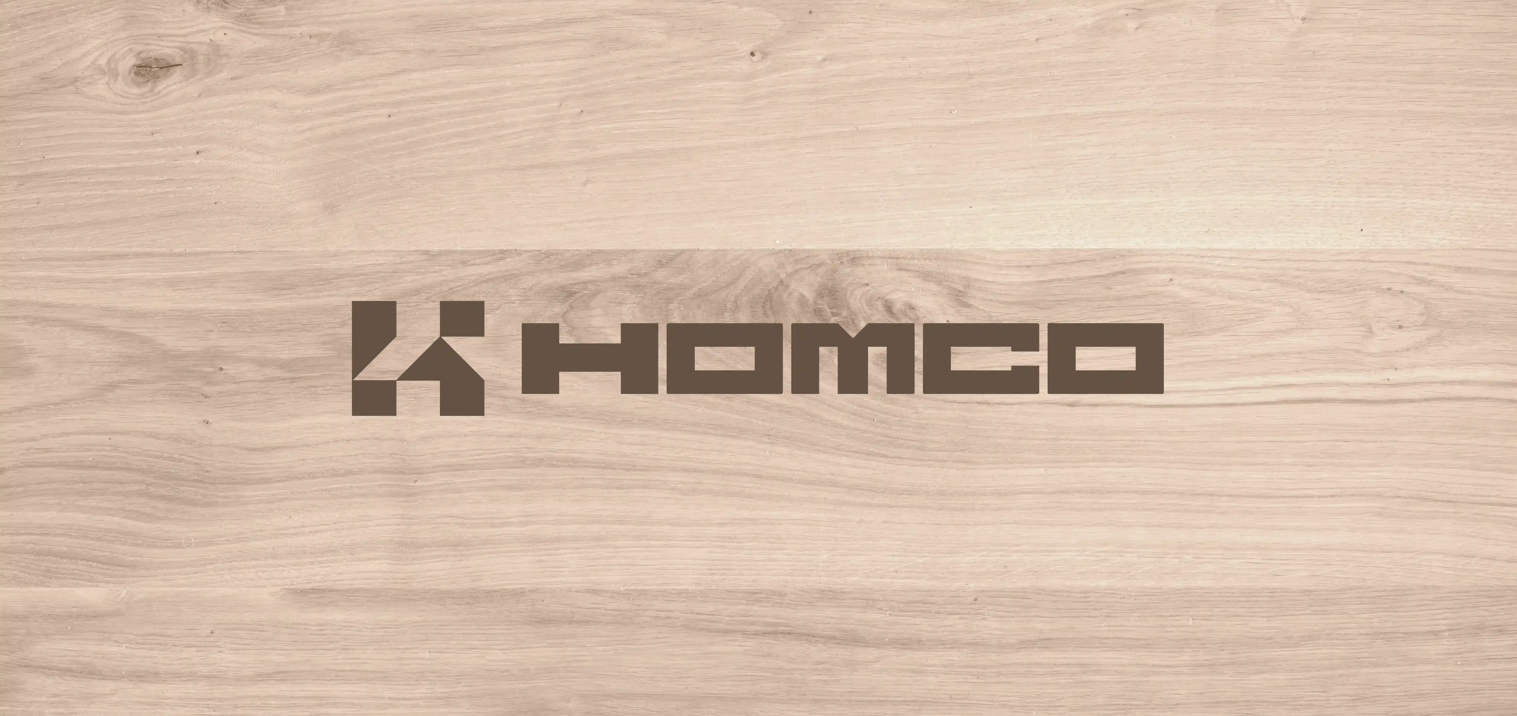
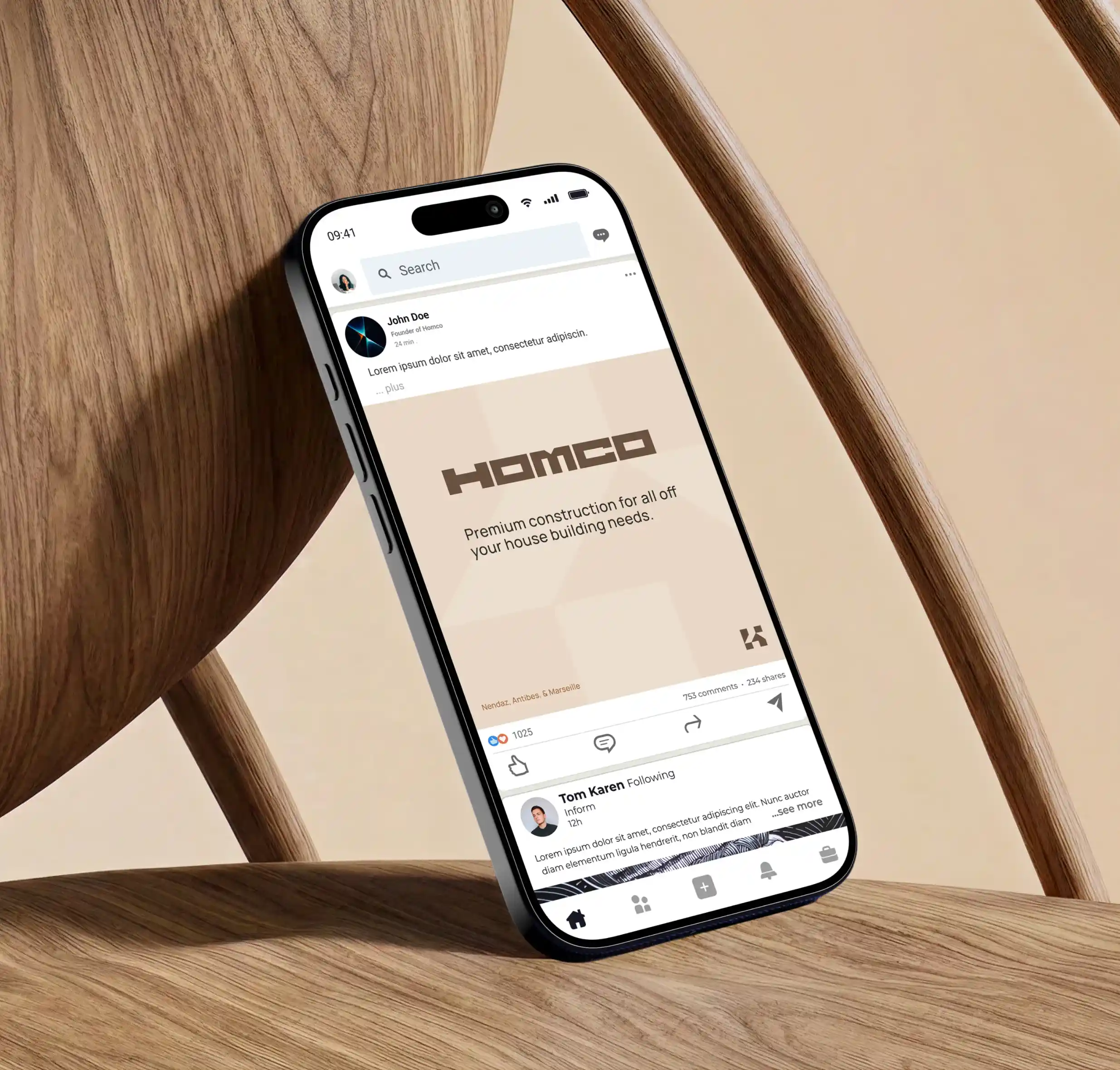
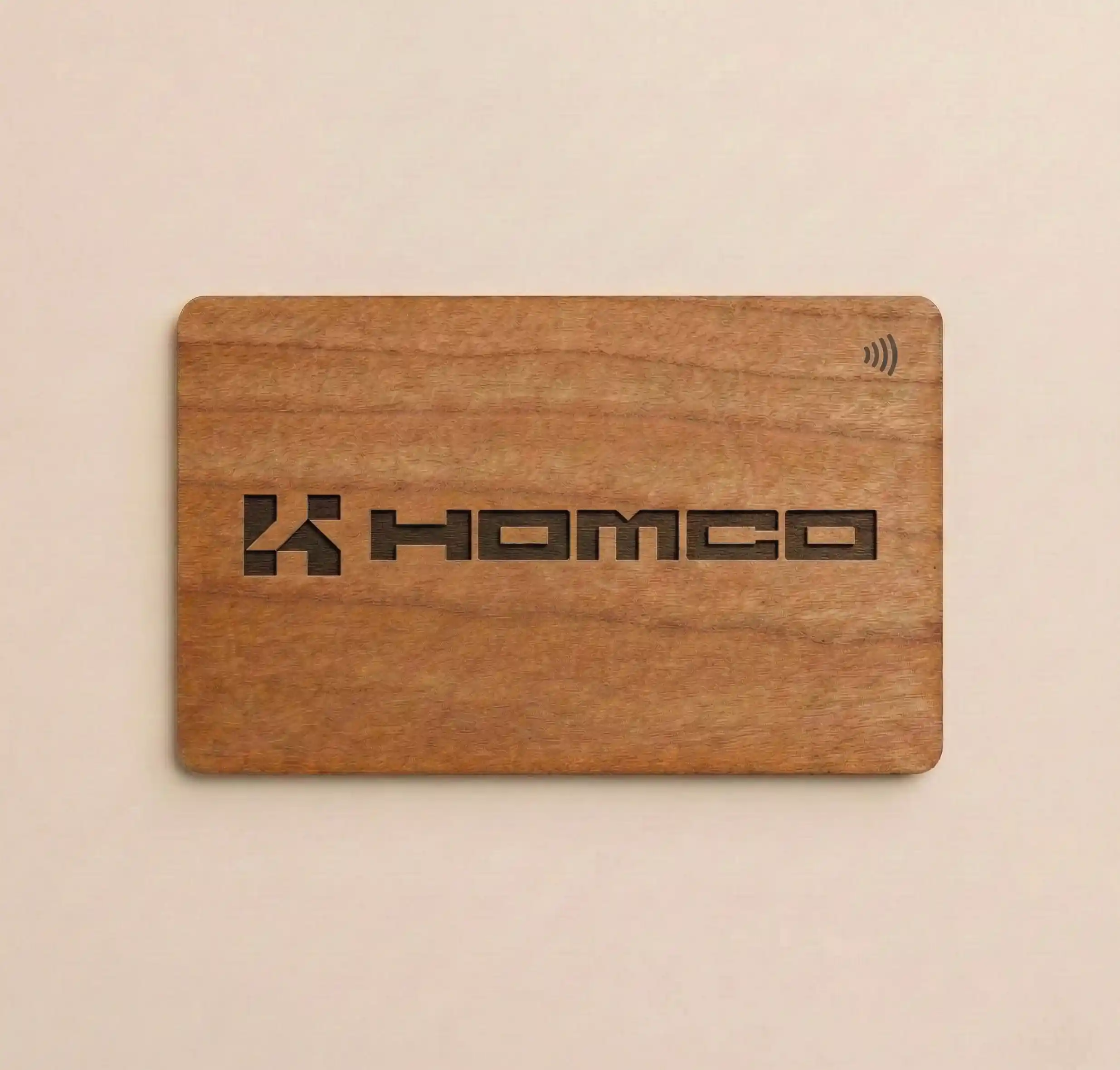
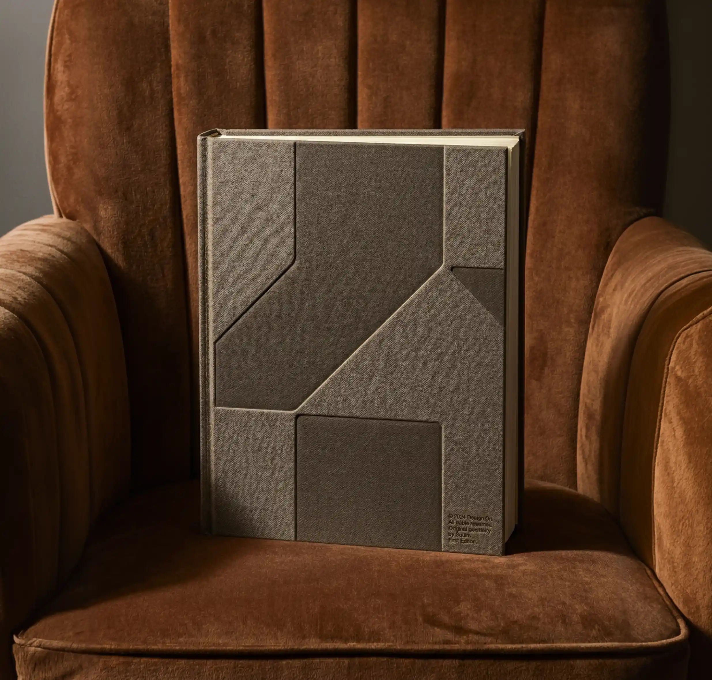
We developed comprehensive brand guidelines to define their new visual identity. This included the creation of a distinct logotype and a cohesive brand style. We curated a robust, material-inspired color palette featuring Ebene, Noyer, Pin, Hetre, Argile, and Granite. Additionally, we established clear rules for typography, photography, and iconography to be applied across various touchpoints, including digital business cards.

The Impact:
The resulting identity solidifies their positioning as "The Foundation of Excellence". By delivering a consistent and elevated brand style, HOMCO is now visually equipped to communicate their high standards and engineering precision to all future clients and partners.