Case Study
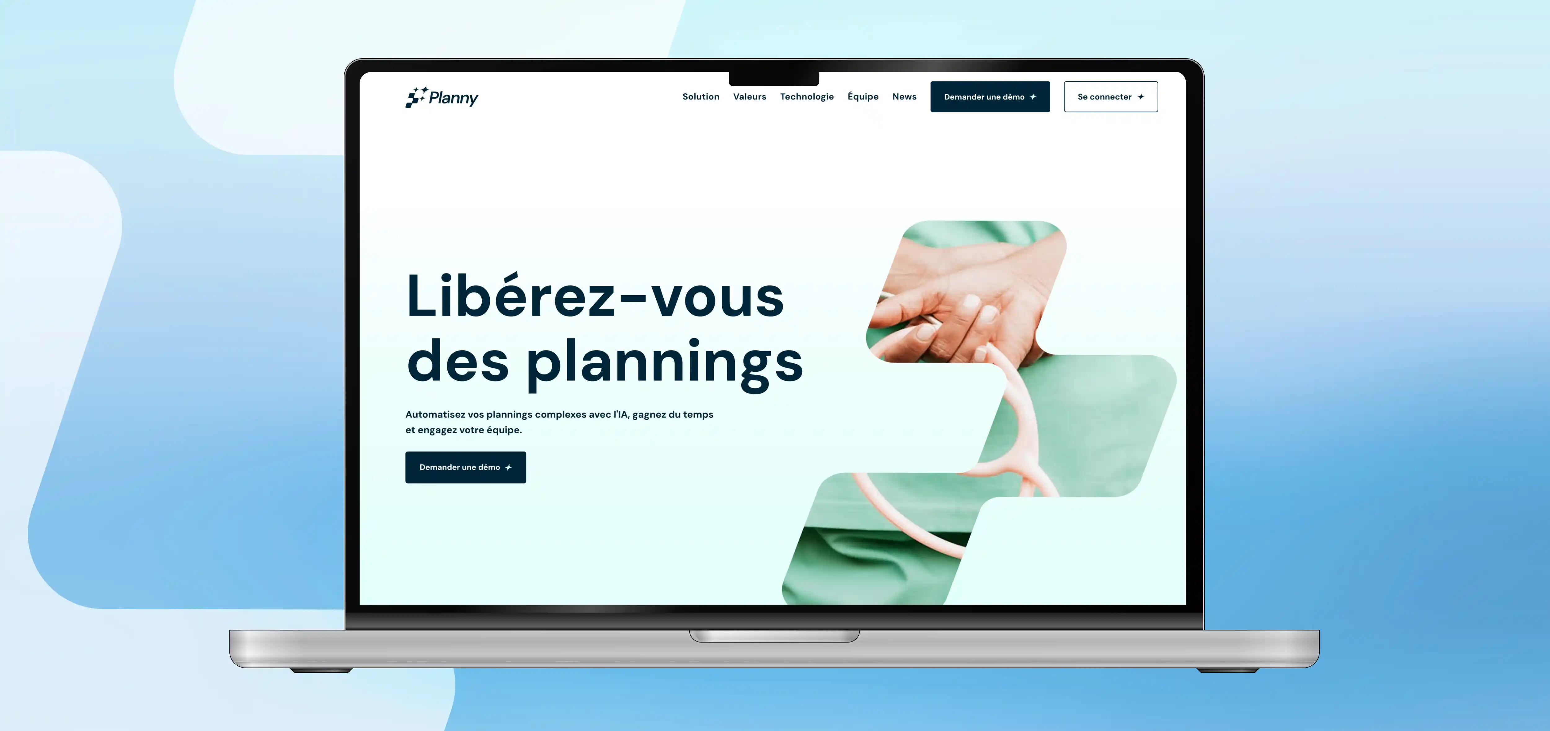
Planny is a dedicated Workforce Management platform. The project focused on crafting a visual identity that perfectly illustrates the intersection of structure and innovation. The primary challenge was to visually translate the core mission of the brand: freeing users from the burden of complex scheduling. The design needed to evoke the rigorous organization required in their industry, while simultaneously conveying the magic touch brought by Artificial Intelligence. Furthermore, the typography had to strike a delicate balance between technical precision and human warmth.

The Solution:
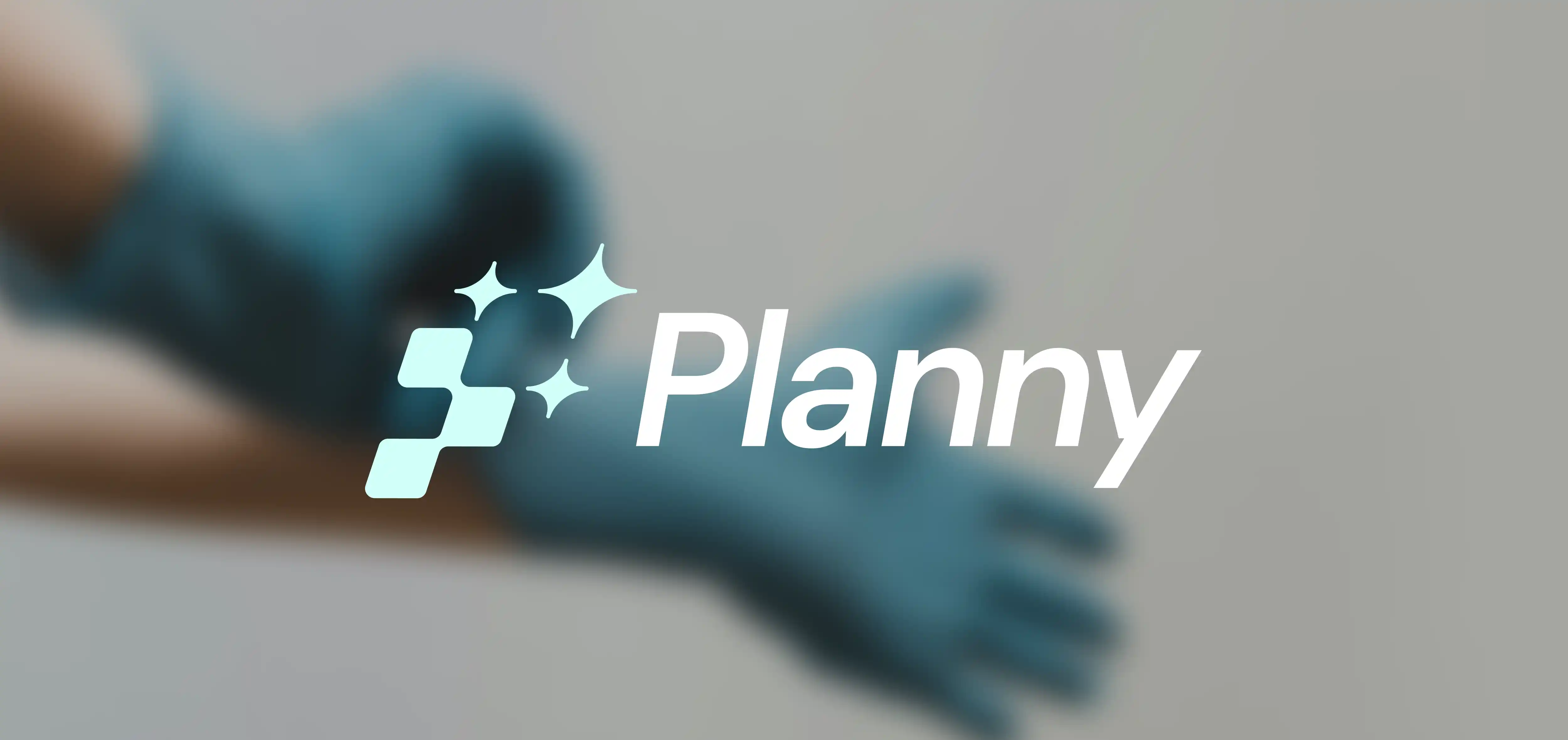
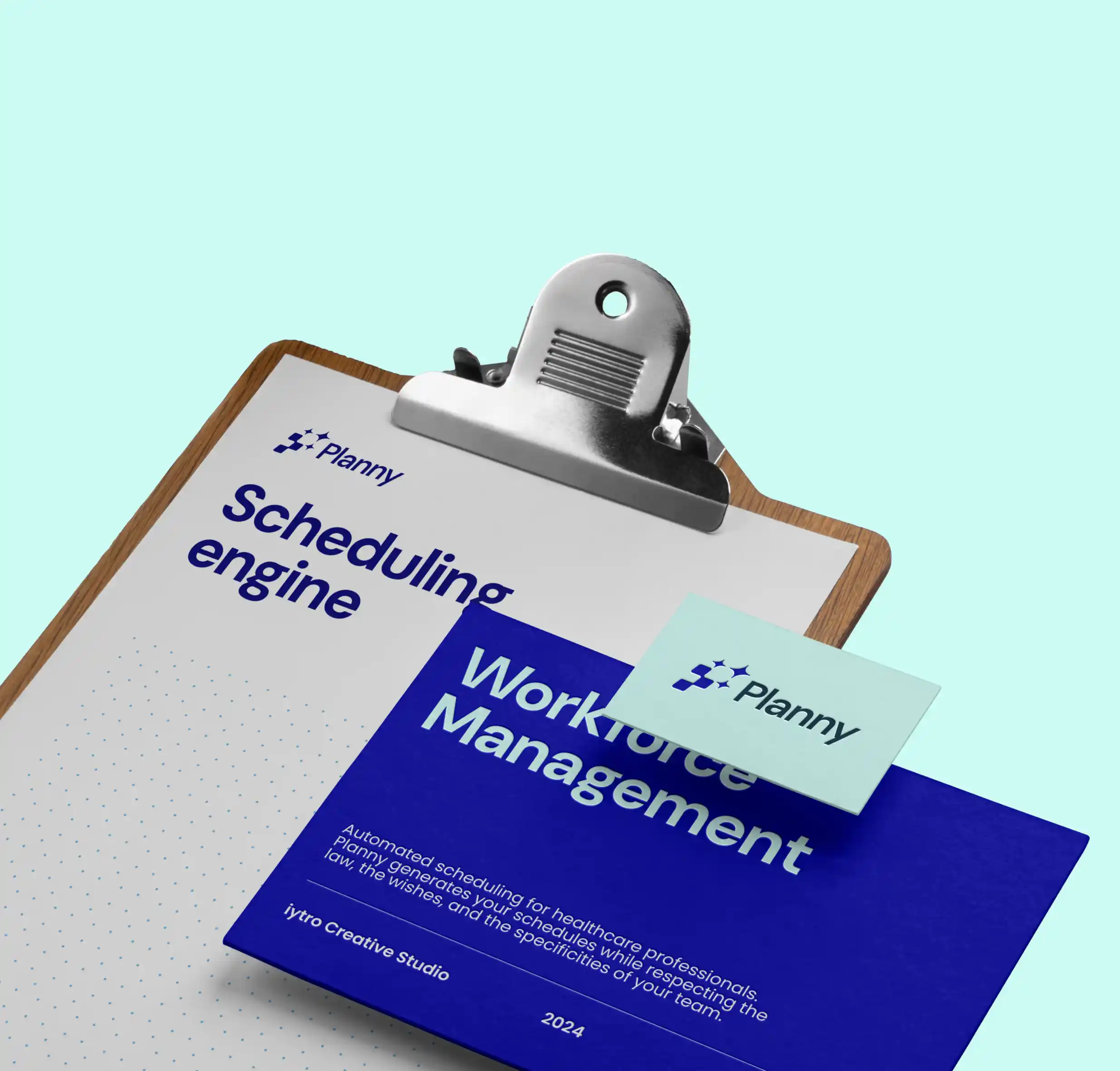
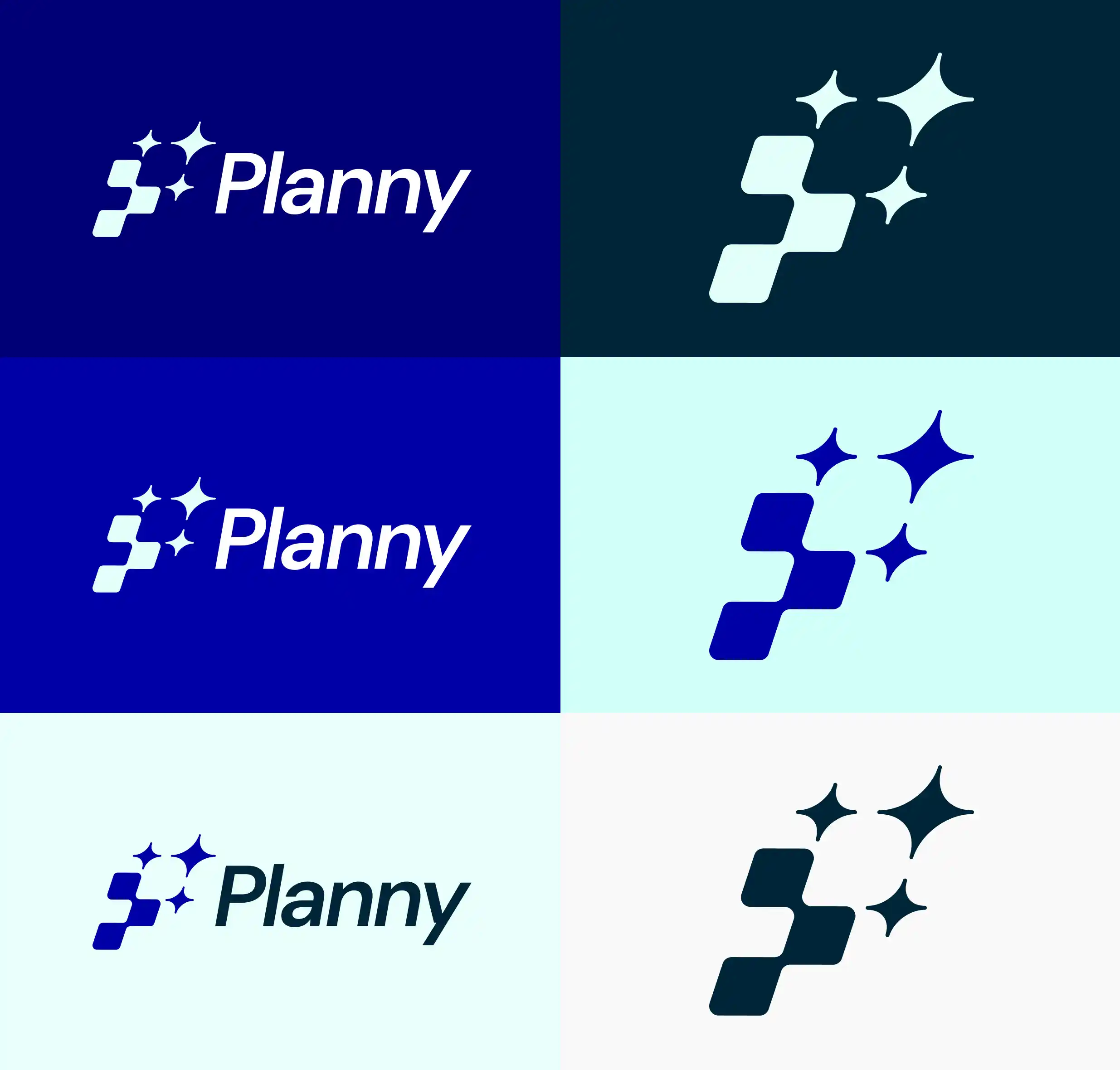
We developed a comprehensive brand board and landing page design to unify the visual language of Planny. The logo is built on a modular grid, utilizing geometric blocks to suggest the letter P and represent solid organizational structure, accented with sparks symbolizing the power of AI. The palette features deep blue contrasts for interface clarity, paired with DM Sans typography and clean, functional contour iconography.

The Impact:
The new identity and landing page design effectively communicate the value proposition of Planny. The clear branding successfully positions them as a revolutionary tool in schedule management, conveying their user-friendly approach and solution-oriented service directly to their target audience.