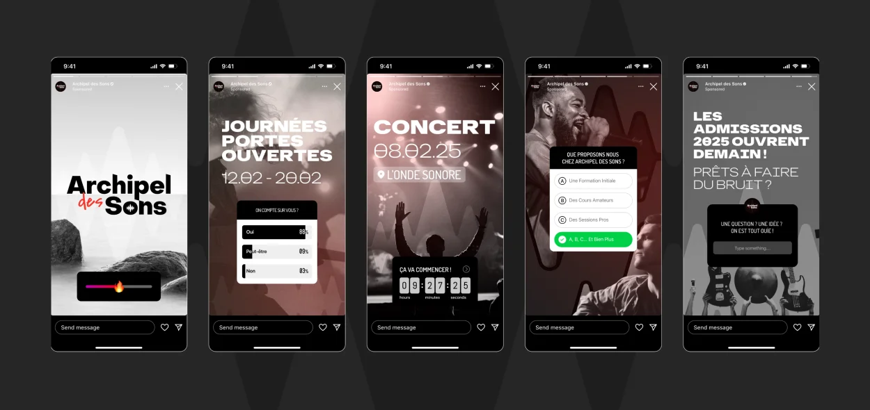
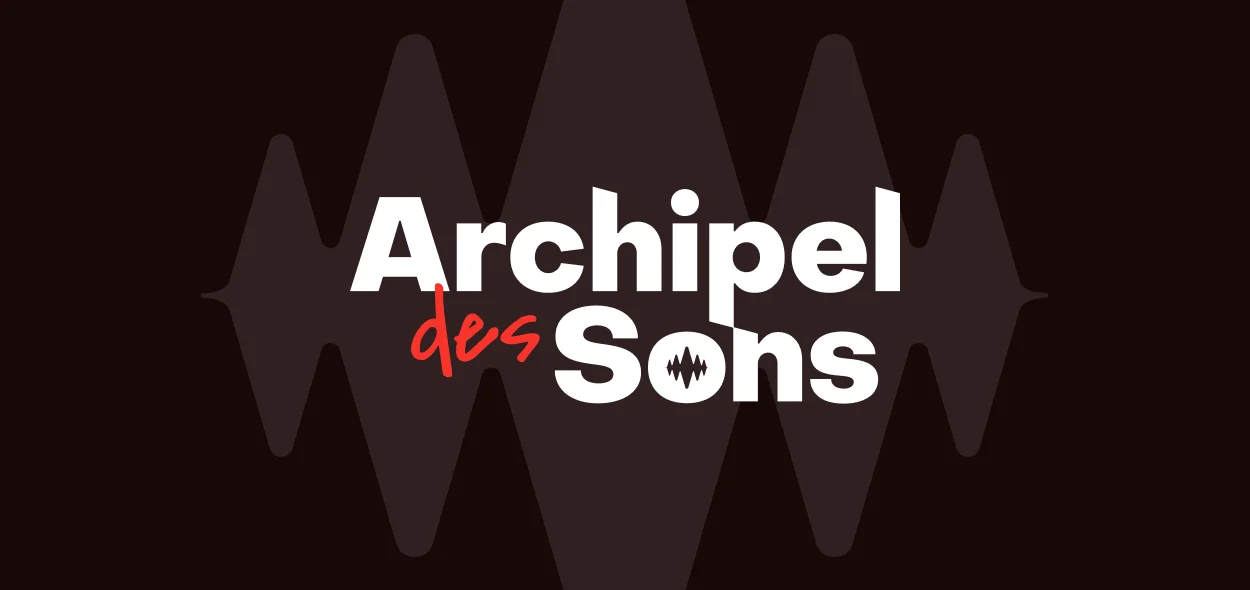
Case Study
Can music education become a visual journey? Archipel des Sons needed a brand that resonated with the joy of discovery and the structure of learning. We managed a complete branding project, taking them from initial positioning to a fully realized identity and digital presence. See how we translated the language of sound into a visual landscape that invites users to explore and learn.
Brand Positioning
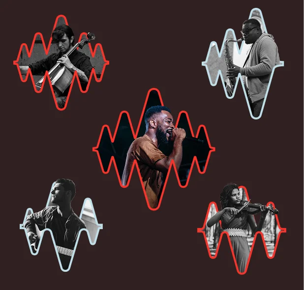
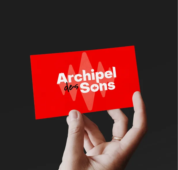
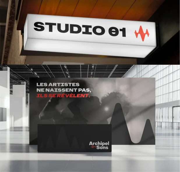
Harmonizing the message — We started by defining the core positioning of the brand, ensuring it spoke to both students and parents. The resulting visual identity combines playfulness with educational credibility. We used rhythmic visual elements and a welcoming color palette to demystify music theory and make the learning process feel accessible and engaging.
Web Experience
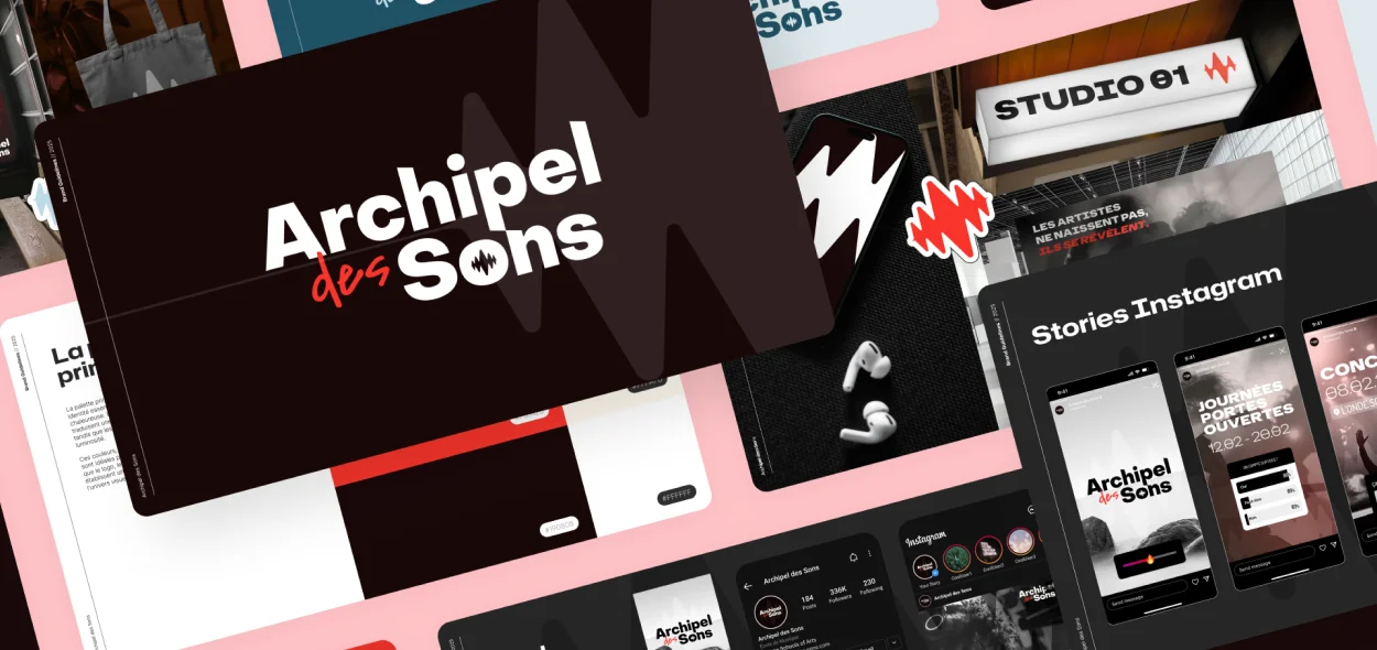
Navigating the archipelago — The website was designed as an extension of the classroom—intuitive, inspiring, and easy to navigate. We prioritized UX/UI best practices to ensure that prospective students could easily find course information and register, turning a standard educational site into a dynamic portal for musical exploration.