Case Study
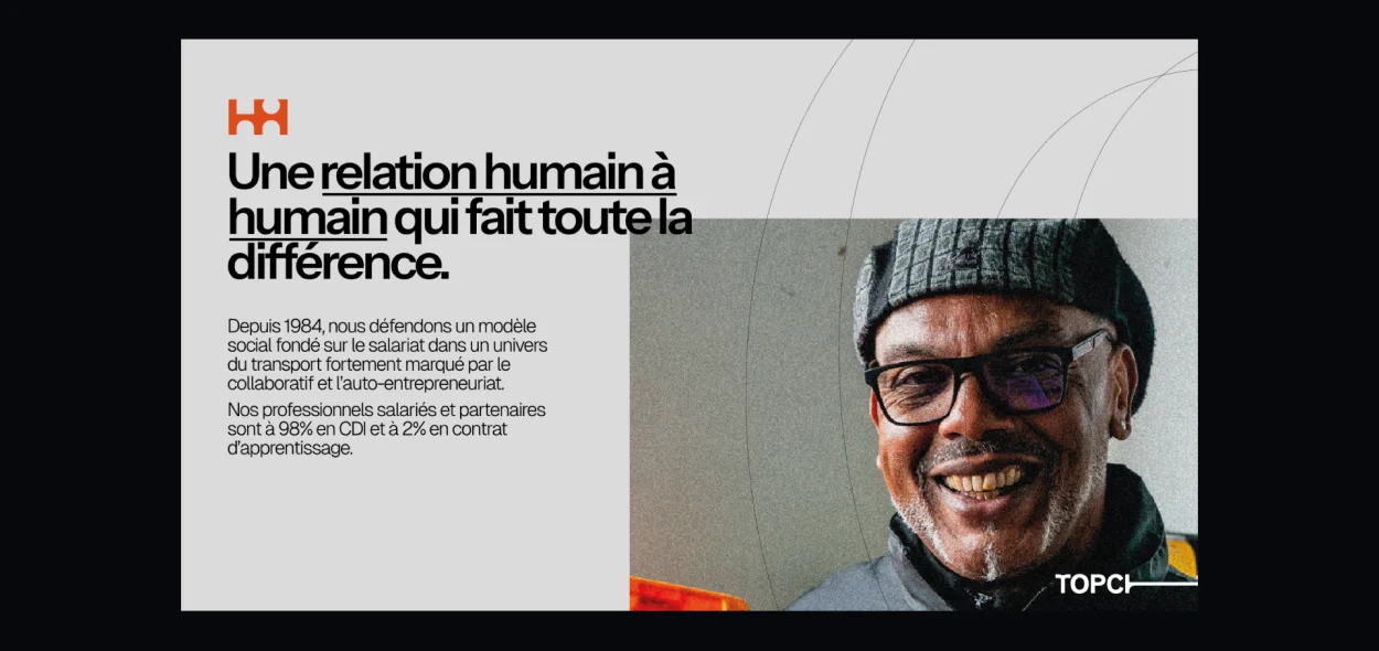
Can a decades-old delivery brand move at the speed of modern expectations? Topchrono challenged us to rethink their entire visual identity — from a striking new logomark inspired by motion, speed, and infrastructure, to an elevated digital experience that drives engagement. Dive into how we unified their fleet, uniforms, and online presence under one sharp, future-ready design language.
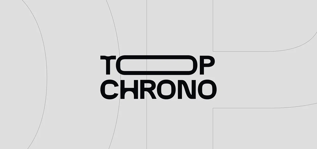

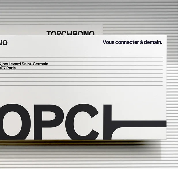
Brand System
A bold identity for a trusted name — The studio engineered a new visual system built around rhythm, structure, and motion. The typographic construction emphasizes precision and strength, while the dynamic grid and graphic lines convey speed and flow — a visual echo of TopChrono’s name and business.
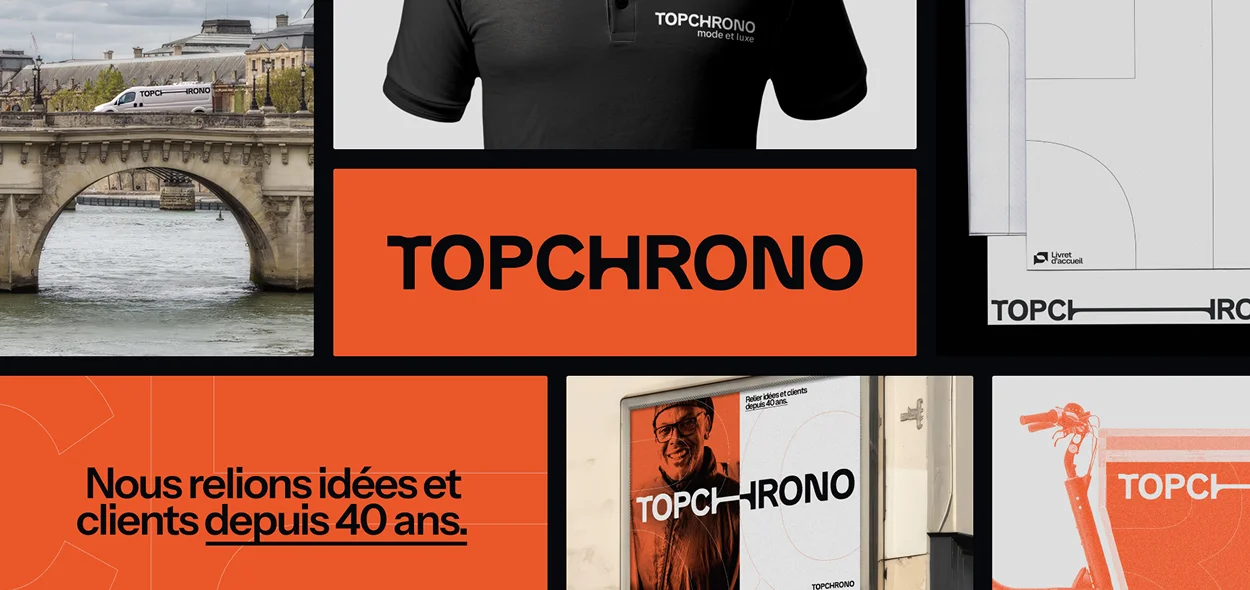
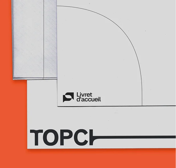
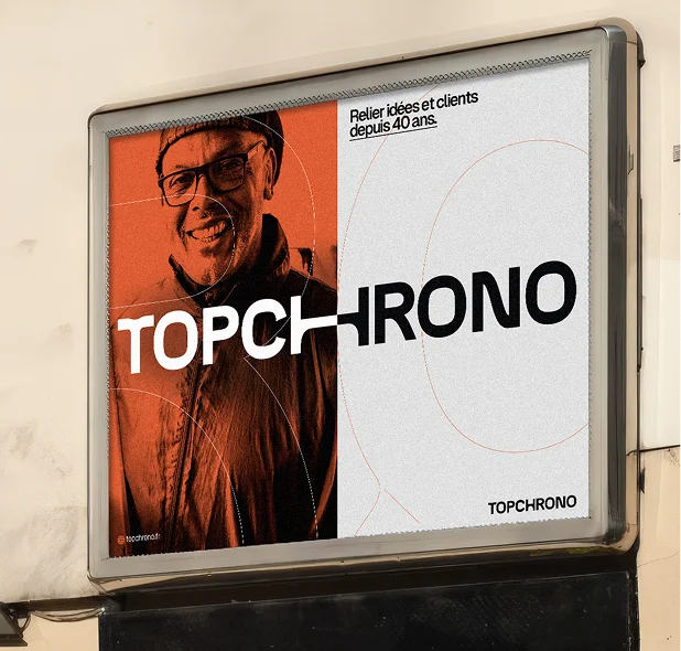
Visual Identity Rollout
Connecting people, cities, and ideas — From signage to uniforms, vehicles, and communication materials, the new identity unites all brand expressions under a cohesive and confident system. The vibrant orange and deep black palette brings energy and visibility, while the refined use of geometry reinforces the brand’s professionalism and heritage.